
What the label needed from the start
The client was a small local apparel label based in Jeffreys Bay, serving surfers, visitors and regulars who buy when the wind picks up and the shops get busy. They came to us with a practical brief: a clean tee range that could move quickly at markets and in-store, then be repeated without colour drift or size mix-ups.
They wanted the artwork to sit well on lighter and darker garments, with a print that could handle repeated washing, salt air and general wear. The range had to work for both single piece retail sales and small reorders, so we planned it around flexible production rather than a one-off batch that would be hard to repeat.
- Client type: surf label and weekend retail stock
- Town: Jeffreys Bay, with sales into nearby towns and coastal outlets
- Range: T-shirts first, then matching hoodies and caps
- Use: weekend sales, restocking and small promotional drops
Artwork, colour and garment choices
We started with the artwork setup and tightened the file for screen printing, checking line weight, print size and placement so the final result would sit straight on the chest and back. The client wanted a bold front mark, plus an option for a larger back print for selected pieces. We also prepared a neck label print for a more finished retail feel.
Colour matching mattered here. Coastal light can make pale inks look different on the table than they do on the garment, so we tested the main brand colour under workshop conditions before running the full batch. That saved time later and kept the range looking the same across each repeat order.
- Artwork setup completed for front chest, back print and neck label use
- One colour print used for the core tee range
- Multi-colour options prepared for special drops
- Sample strike-offs checked before approval
Printing the first run in Jeffreys Bay
The first production run was printed at our Jeffreys Bay industrial area base, which made collection and follow-up easy for the client. We used screen printing because it gives a clean finish on cotton tees and holds up well for regular wear. For the core label stock we ran one colour prints, and for a few feature pieces we added oversize back prints to give the range a stronger retail look.
The production line was kept tight and practical. Thobeka handled press work, Ridwaan checked the artwork flow, and Jason managed finishing so the garments came off the table folded, counted and ready to bag. On a project like this, small details matter. A slight misprint or loose count can cost a weekend sale, so we kept each step checked before the next one started.
- Screen printing on tees and selected hoodies
- Oversize back prints for featured stock
- Folding and bagging for shelf ready presentation
- Bulk packing separated by size for quick reordering
Timeframe, supply and repeat order support
The project ran over 2 weeks from first briefing to completed stock. Week one covered artwork setup, colour matching and sample strike-offs. Week two covered production, finishing and packing. That timeframe worked well for a small local label because it allowed for approval without dragging the order out longer than needed.
Leandi handled quotes and progress updates, while Megan kept the client informed on collection timing and what was ready for the next sale cycle. Brandon Michael Jacobs oversaw the job from start to finish, making sure the range stayed on brief and that any extra sizes or repeat items could be matched later without confusion. For a surf-town label, repeat support is just as important as the first run because stock needs to be topped up when a good weekend clears the rack.
- Timeline: 2 weeks from briefing to finished stock
- Repeat support set up for future top-up runs
- Size splits packed for easier restocking
- Artwork kept on file for consistent reprints
Results on the ground and what changed for the client
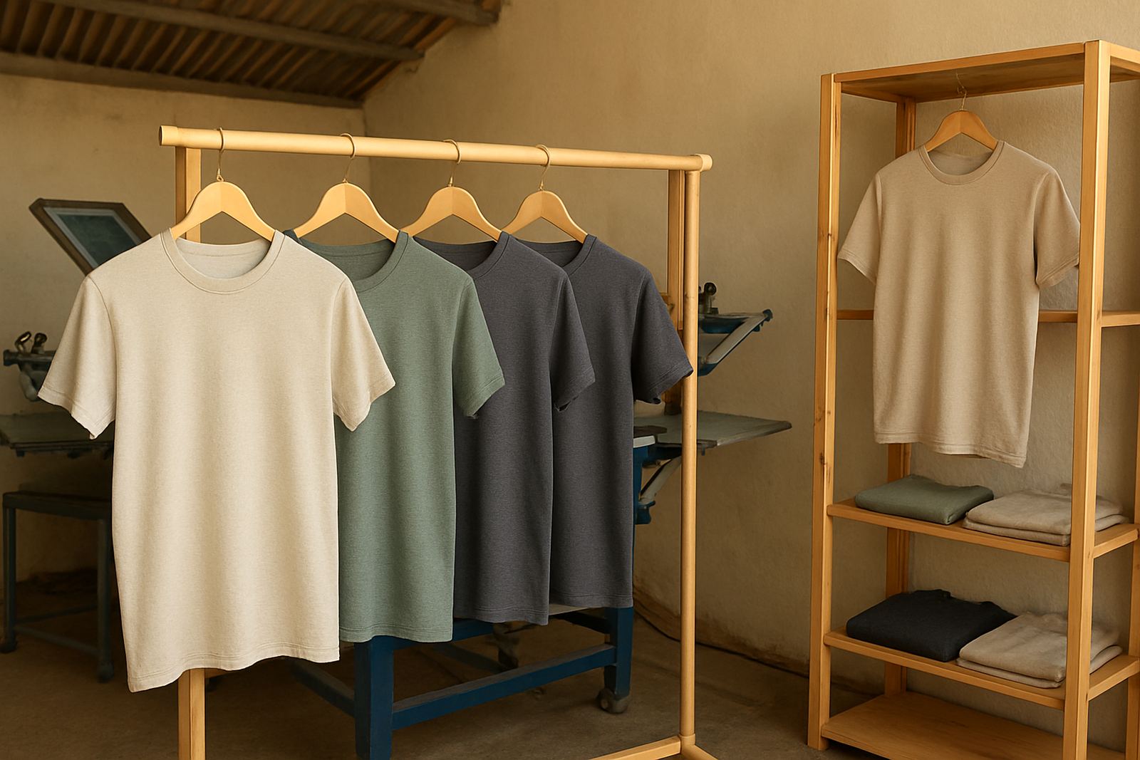
The finished range gave the client a clean, professional product that suited both casual surf wear and small retail sales. The tees looked consistent across the run, the print stayed sharp after washing, and the bagged stock was easy to move from storage to counter display. For a label that sells at weekends, that kind of orderliness saves time when the shop gets busy.
The client also had better control over stock movement because the garments were packed by size and clearly separated. That made it easier to tell what was selling fastest, what needed reprinting, and which sizes to order sooner next time. In a coastal town where weekends can be windy and unpredictable, having stock ready makes a real difference.
- Sharper shelf presentation for retail sales
- Consistent print quality across the full run
- Faster restocking thanks to size-based packing
- Better repeatability for future orders
What we would do again for a similar label run
For a similar surf label project, we would keep the same approach: start with a clean artwork setup, approve a sample strike-off early, and run the core range in a dependable one colour print before adding special pieces. That method keeps costs under control and helps the client place stock where it will actually sell.
We would also keep folding and bagging in the workflow, because label stock looks more polished when it arrives ready for shelf or market table use. If the next run included school events, club wear or staff apparel, we would extend the same process to hoodies, caps and team kit so the range stays consistent from one item to the next.
- Best for: local labels, schools, clubs and small retail ranges
- Best garment mix: tees first, then hoodies and caps
- Best print path: sample first, then repeat with matching settings
- Best finish: folded, bagged and packed by size
Key facts
| Project | JBay Surf Label Tees |
|---|---|
| Client type | Small local surf label |
| Location | Jeffreys Bay, Eastern Cape |
| Services used | Screen Printing, Artwork Setup, Colour Matching, Sample Strike-Offs, Folding and Bagging |
| Timeline | 2 weeks |
| Core output | Printed T-shirts with repeat order support |