Why every ink colour adds work at press time
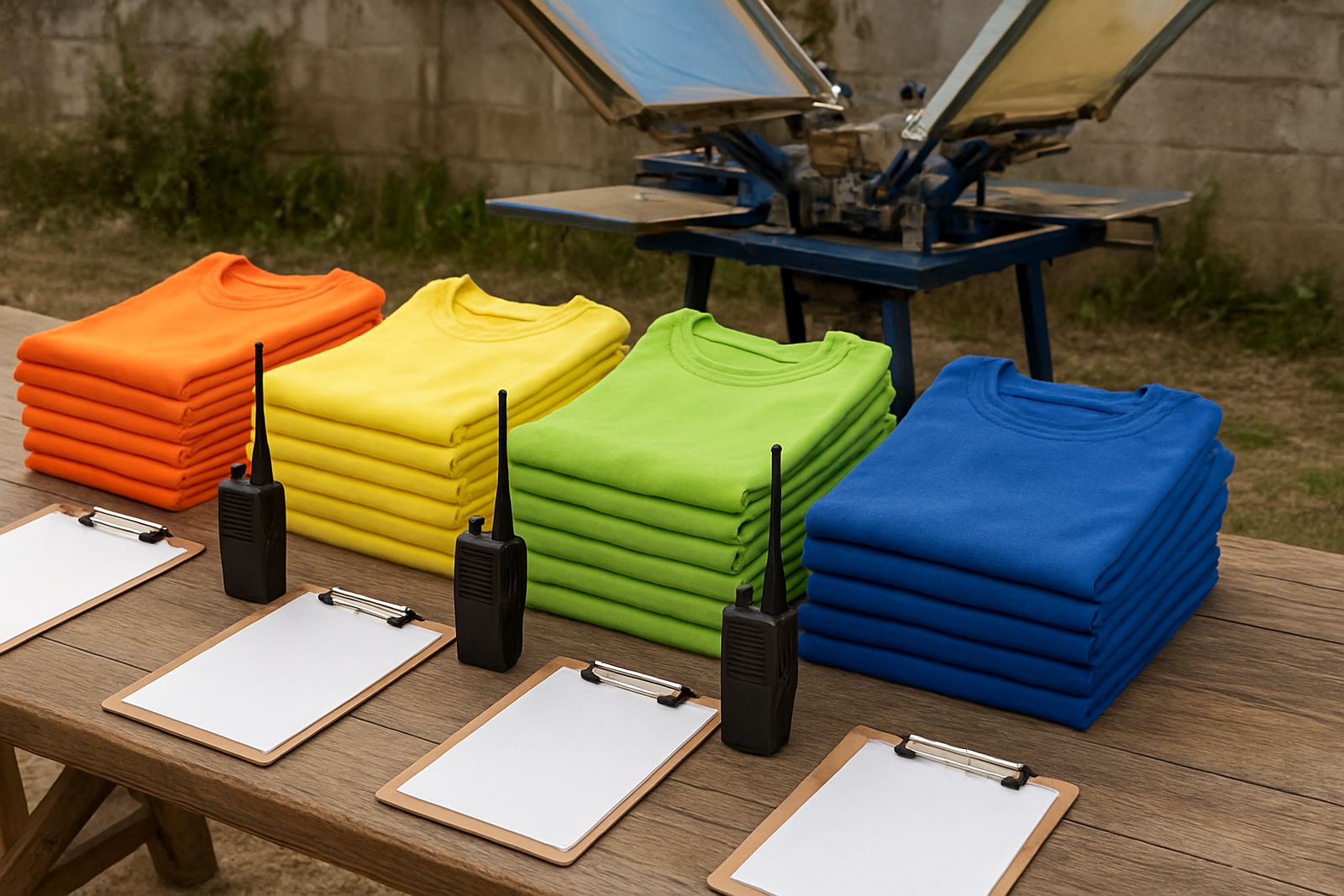
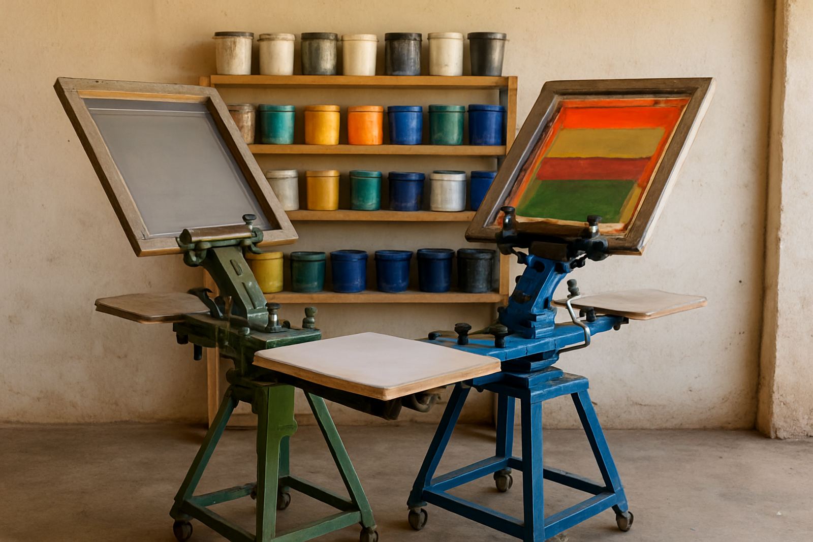
Screen printing is priced on more than just the garment. Each colour in the artwork needs its own screen, its own setup and its own pass on the press, which is why a one-colour job is usually quicker and more affordable than a multi-colour print.
For schools, clubs and surf-town brands in Jeffreys Bay and the Kouga area, this matters when ordering team shirts, hoodies or event wear. A simple one-colour chest logo can move through production fast, while a three-colour design may need more prep, tighter alignment and extra drying time. That extra time does not just affect cost, it affects scheduling too.
At our industrial area base, we plan jobs around the full process, from artwork setup to finishing. A clean file with fewer colours is easier to separate for print, and that keeps the quote sharper. If the artwork has gradients, shadows or several small highlights, we may need to simplify it for screen printing so the final result stays neat and practical.
What setup actually means on a screen printing job
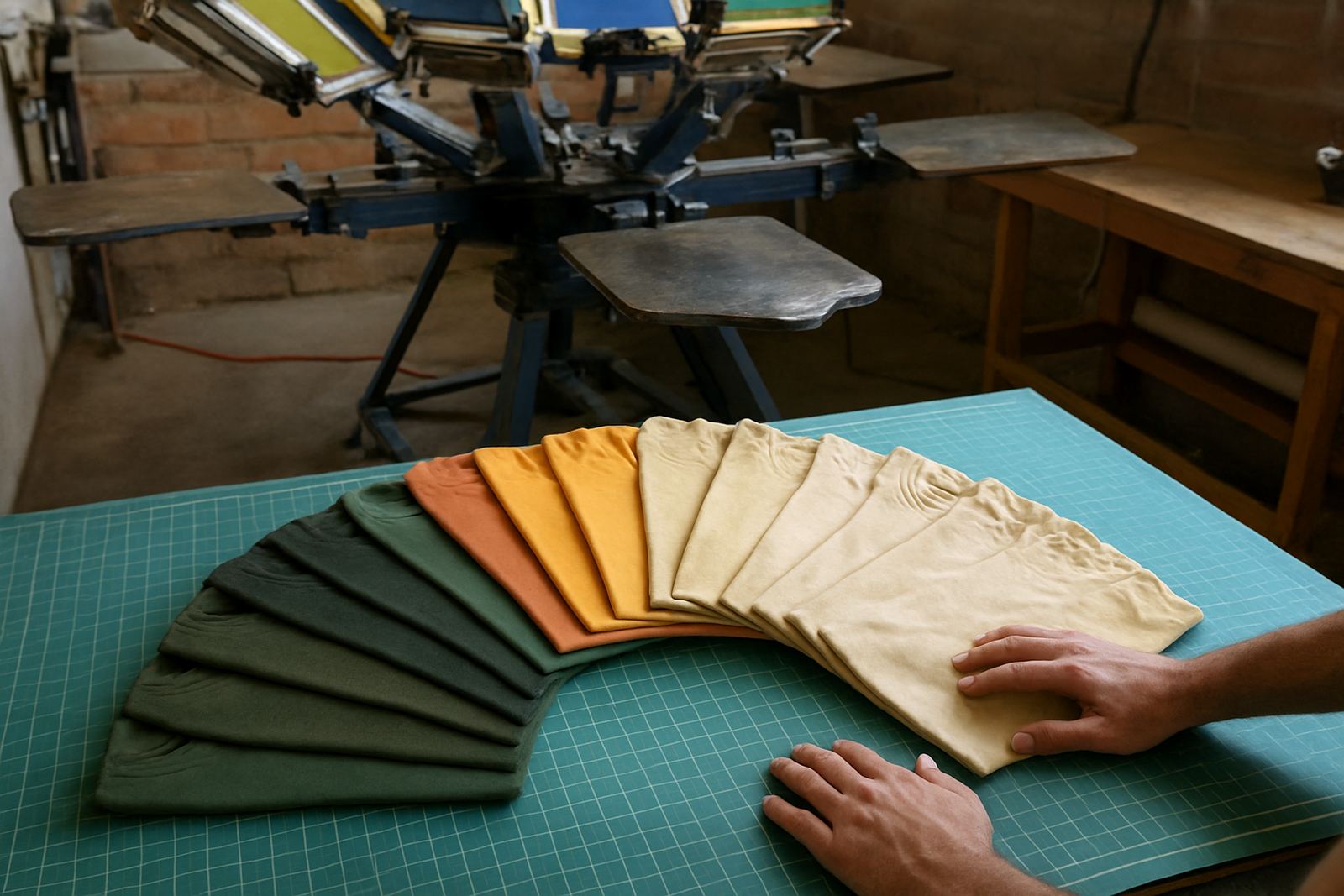
Setup is the part customers do not always see. Before ink goes onto the garment, the artwork must be prepared, separated into colours, and matched to the fabric and print position. That is true whether you are printing 20 caps or 500 event T-shirts.
Typical setup steps include:
- Artwork preparation and size checking
- Colour separation for each ink used
- Screen creation and alignment
- Test prints or sample strike-offs where needed
- Press adjustments for fabric type and print area
The more colours in the design, the more steps are involved. A one-colour left chest print may need a simple setup. A multi-colour back print on a hoodie can take longer because the thick fabric and seams change how the print sits. On coastal orders, we also think about humidity, because damp conditions can affect drying and handling if the job is rushed.
How colour count changes your quote
When we prepare a quote, the number of print colours is one of the biggest price drivers. Garment type, print size, quantity and ink coverage also matter, but colour count often has the clearest impact on production time. More colours usually means more screens, more labour and more risk of misalignment, so the job needs more attention.
In plain terms:
- One-colour prints are usually best for budget-conscious bulk orders
- Two-colour prints suit logos that need a bit more presence without going overboard
- Three or more colours are better for detailed artwork, but they cost more to prepare
- Large prints, like oversize back prints, can increase ink use and drying time
If you are working to a school fundraiser budget or a club committee approval, a cleaner design can save money without looking cheap. A strong single-colour logo on a quality shirt often gives a better finish than a crowded artwork file that needs too many screens.
A practical Jeffreys Bay example from school and club wear
Say a surf club in Jeffreys Bay wants 80 cotton T-shirts for a weekend event, with a front logo and a back sponsor line. If the front is one colour and the back is one colour, the job stays relatively straightforward. Add a third colour to each print location, and the setup time grows quickly.
That difference shows up in the quote, but also in planning. Multi-colour work needs more checks, especially if the order includes mixed sizes, youth garments and adult sizes in the same batch. It also matters whether the order is going out to Humansdorp, St Francis Bay or Gqeberha, because collection timing can affect finishing and packing.
For repeat orders, it helps when the artwork stays consistent. If a school reorders its sports tops next term, keeping the same colour count and print positions lets us move faster. That is useful when there is little time before a tournament or matric event, and nobody wants last minute changes.
Choosing the right print style for the artwork you have
Not every design needs to be reduced to one colour, but every design should be matched to the garment and the budget. A clean logo, a bold slogan or a simple team mark usually works well in screen printing. A photo style image or detailed illustration may need a different approach, or it may need to be simplified before print.
When we review artwork, we look at whether the design will print clearly on the chosen garment and whether the colour count is practical for the order size. That is especially important for hoodies, caps and sleeve prints, where smaller spaces and curved surfaces can make fine details harder to print neatly.
- Use fewer colours when the message matters more than the detail
- Keep fine lines thick enough to hold up on fabric
- Ask for a sample strike-off if the design is new or complicated
- Choose print positions that suit the garment and the size range
Planning ahead saves time when load-shedding or weather interfere
In the Eastern Cape, production planning has to allow for more than just the artwork. Load-shedding, humidity and courier timing can all affect how quickly a job moves through the press and finishing area. A colour-heavy order is harder to rush, because each stage needs proper drying and checking before the next one starts.
That is why we encourage clients to submit artwork early, especially if the order is for a school sports day, a business launch or an event in the Kouga region. If the design is ready and the colour count is practical, we can plan the job around the print run, folding and bagging, bulk packing and collection. It sounds simple, but it saves a lot of stress.
For clients in Jeffreys Bay, Humansdorp, St Francis Bay, Cape St Francis, Oyster Bay, Kareedouw and Gqeberha, the best approach is to think about the print before the deadline is close. A well planned job is easier to quote, easier to print and easier to deliver on time. That is what makes colour count worth paying attention to.