
Start With a Fabric That Sits Well on Many People
For wide public giveaways, the safest starting point is usually a cotton rich tee with a medium weight. It feels familiar, takes screen print well and does not cling too much in the heat. In Jeffreys Bay, where events can run from a windy morning in the industrial area to a warm afternoon near the beach, people notice comfort quickly. A shirt that is too thin can look cheap in the hand and turn see-through in pale colours.
For most promo work, a fabric in the 160 to 180 gsm range gives a good balance. Lighter tees can work for short campaigns, but they often twist at the seams and show wear sooner. Heavier tees cost more, yet they usually sit better on the body and stay presentable when handed out to customers, school groups or club members.
- Choose a fabric weight that feels steady, not flimsy.
- Check that the neck rib keeps its shape after a few washes.
- Ask for fabric that handles heat and coastal humidity without going limp.
- Match the cloth to the use, whether it is a sports day, trade table or fundraiser.
Pick Colours That Carry Your Message Without Fighting the Print
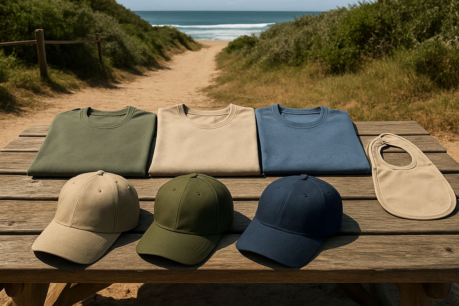
Promo tees are often worn by people who never planned to wear them. That means the colour should be easy on the eye and practical in the real world. Dark shirts can hide stains and look smart for clubs or event crews, while white and light colours often suit schools and public campaigns where a clean, friendly look is needed. Bright shades can work well, but only if the print colour still stands out clearly.
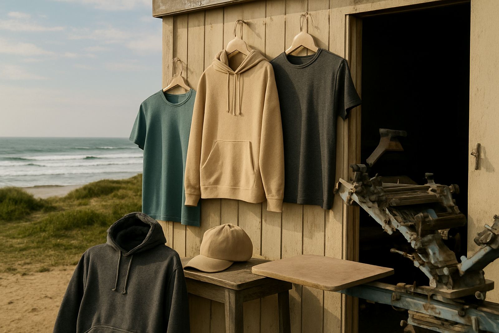
Colour matching matters when a logo must be read from a distance. A pale print on a pale shirt will disappear, and a strong design on a very dark shirt may need extra thought around ink coverage. In areas like St Francis Bay and Oyster Bay, outdoor use is common, so a shirt that still reads clearly in sun and shade is worth more than one that only looks good on a sample hanger. We often help clients compare a few options before they place a bulk order, because the wrong base colour can waste a good design.
- Use a shirt colour that supports the logo, not one that competes with it.
- For public events, avoid shades that make dirt or sweat marks obvious too quickly.
- Test how the artwork reads from 3 to 5 metres away.
- Keep school, club and community colours consistent across repeat orders.
Make Sure the Neckline and Fit Work for Real People
A promo tee is not a fashion fit test. It has to suit men and women, older staff, youth volunteers and sometimes customers who are just taking one home. A narrow neck can feel tight and a very wide neck can stretch badly after washing. The best shirt is usually one that keeps a neat shape without feeling stiff.
Cut is important too. If the tee is too slim it may not suit all sizes, and if it is too boxy it can look careless. For large giveaways in Kouga and Gqeberha, a regular fit is often the most practical choice. It allows room for movement, stacks neatly in bulk packing and gives your printed artwork a cleaner area to sit on the chest or back. When people actually want to wear the shirt after the event, that is a better result than a gimmicky fit that looks good for one photo only.
Think about how the shirt behaves when folded, packed and handed out. A neat side seam, a stable shoulder line and a collar that stays flat all help the garment feel properly made. Those small details are noticed, even if no one names them out loud.
Printing Space Should Match the Message You Want Seen
Good promo tees give the print enough room to breathe. If the artwork is too small, it gets lost. If it is too large for the fabric, it can pull awkwardly across the chest or wrap badly around the side. Screen printing suits clear, strong artwork, and it works especially well when the design is planned for the shirt size from the start.
Many giveaway tees need a simple front mark, but some campaigns call for oversize back prints, sleeve printing or a neck label print for extra detail. A school event might need a front logo and sponsor names on the back. A surf-town promotion might need a bold back print that people notice at a distance. The key is to choose a garment that can carry the artwork properly without looking overworked. Sample strike-offs are useful here because they show how the print sits on the actual fabric, not just on paper.
- Keep artwork clear and legible, especially for public giveaways.
- Leave enough blank space around the logo so it does not crowd the shirt.
- Use print positions that suit the garment size, not only the design file.
- Ask for a sample strike-off if the order is going to a big crowd or event.
Durability Matters More Than Fancy Claims
For giveaway shirts, the test is simple: will people keep wearing them after the event? If the answer is yes, your message lasts longer. That means the print should hold up to washing, the shirt should not shrink badly and the colour should not fade too quickly. In a coastal area like Jeffreys Bay, salt air and humidity can be hard on weak fabric and poor storage, so the garment choice matters right from the start.
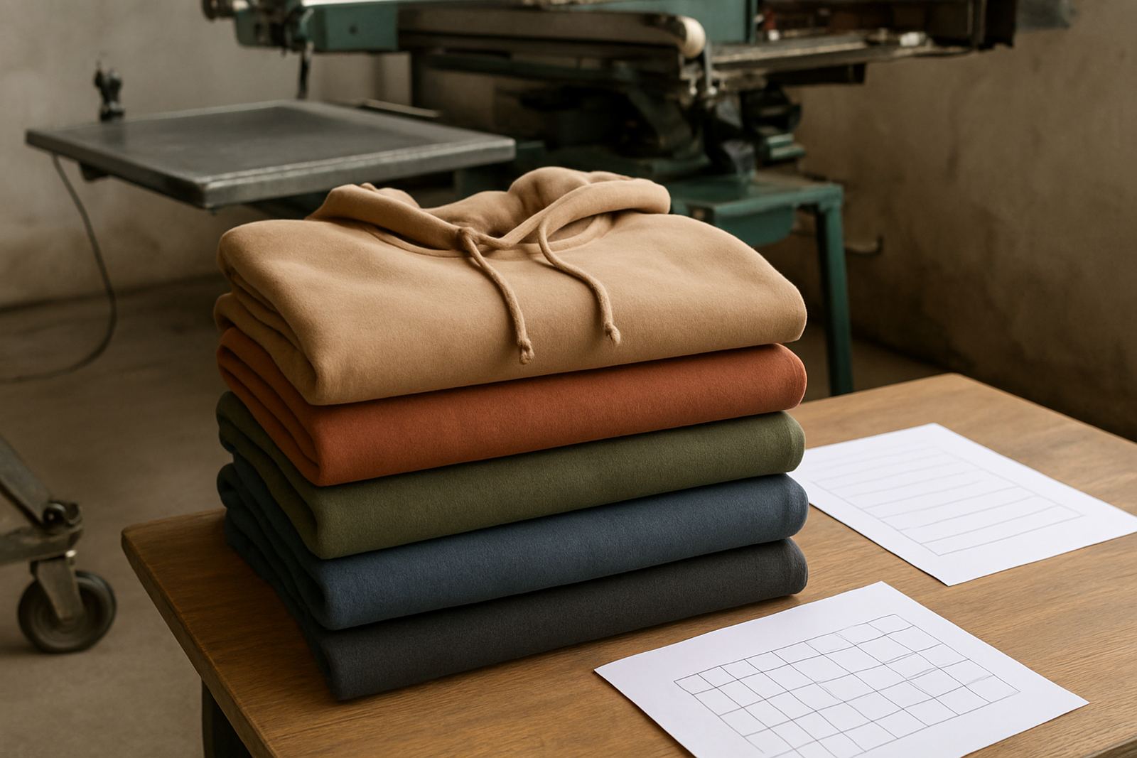
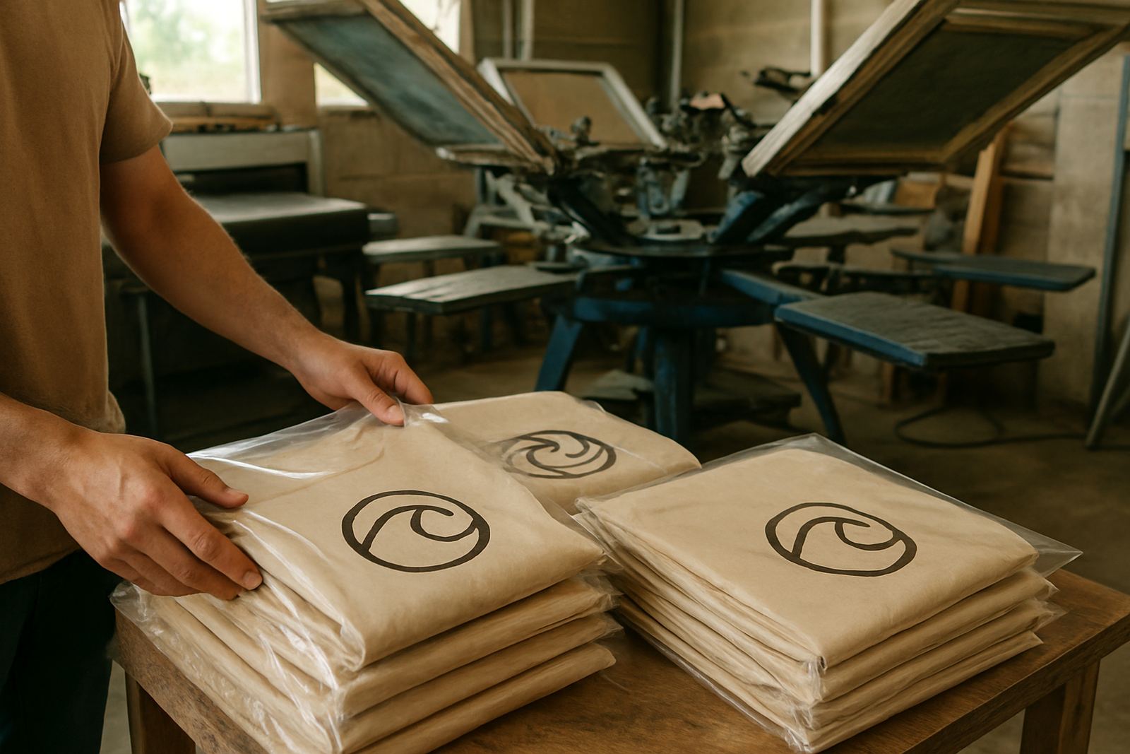
Repeat order support also becomes important when a club, school or business wants the same look again next season. A tee that is easy to reorder and easy to match saves time and keeps your branding consistent. It also helps when you need to pack hundreds of shirts for an event and want them folded, bagged and ready without extra handling. For bulk giveaways, simple and durable is usually better than trendy and delicate.
It helps to think beyond the first handover. A shirt that survives a few washes, a hot car boot and regular wear is doing its job. The stronger the base garment, the better the print will look for longer.
A Local Giveaway Example From the Kouga Coast
Imagine a surf club or school fundraiser in Jeffreys Bay with 300 shirts to hand out before the weekend. The best choice is rarely the cheapest shirt on the shelf. A medium weight tee in a practical colour, with a neat front print and a clear back sponsor line, is far more likely to be worn again at home, on the road or at the next club gathering.
For that kind of order, the process needs to stay organised. Artwork setup must be accurate, colour matching should be checked and the packing has to be clean so each size is easy to sort. If the event is heading toward Humansdorp, St Francis Bay or Gqeberha, timing matters too because people do not want to collect a pile of shirts at the last minute. A well planned promo tee order makes the whole giveaway feel considered, not rushed.
That is why practical clients ask simple questions first. What fabric will wear best? Which colour prints clearly? How many sizes are needed? Will the shirts be folded and bagged for easy issue? Those are the questions that turn a basic freebie into something people actually keep.