
Why print position matters more than people think
When clients ask about branded clothing, the first question is often colour. The second is size. But placement decides whether the garment reads as neat and professional, or busy and awkward. A logo on the left chest gives a different feel to a full front print, and an oversize back print changes the whole shape of a shirt. The same artwork can work hard or sit quietly depending on where it goes.
That matters for surf-town businesses, schools, clubs and event teams around Jeffreys Bay because branded wear needs to do a job. It must be seen from a distance, hold up after repeated washes, and still feel comfortable in summer heat or when layered over a hoodie in winter. Good placement helps with all of that.
- Small chest marks suit staff uniforms, admin teams and visitor shirts.
- Centre front prints work well for events, campaigns and youth wear.
- Back prints are useful when people need to be seen from behind.
- Sleeve and neck placements add detail without crowding the garment.
Left chest prints for a neat everyday look
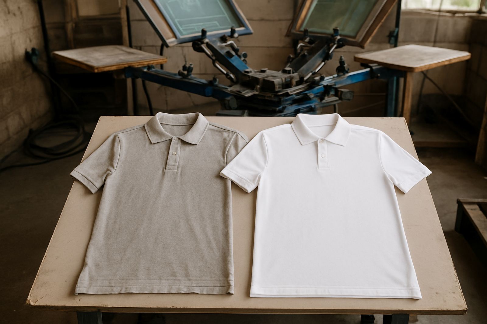
Left chest placement is still the most practical option for many clients. It is tidy, easy to recognise, and works well on T-shirts, golfers, hoodies and overalls. In a school or club setting, it gives a clean point of identity without taking over the whole garment. For businesses, it also leaves room for names, role titles, or extra details if needed.
This position is especially useful when the garment will be worn all day. A left chest logo does not stretch across the stomach or sit under a backpack strap. It also prints well on repeat orders because the position can be kept consistent from batch to batch. For many local teams it is the safest choice when they want the same look every time.
- Best for logos that need to look smart and restrained.
- Good on corporate shirts, school wear and club apparel.
- Works well with one colour prints and simple artwork.
Centre front prints for events and stronger visibility
Centre front placement is better when the garment must speak loudly. Think event staff, race days, fundraisers, school productions or promotional shirts handed out at a market. It gives your message the widest viewing area and lets the print sit where people look first. On lighter garments, it can feel bold and direct. On hoodies, it gives a strong branded block across the chest.
There is a balance to keep in mind. A very large front print can make a shirt feel heavier visually, especially if the artwork has many colours. We often suggest testing the size against the garment width before approving the final layout. A print that is too low can look odd, and one that is too high can crowd the neckline.
- Useful when the garment must be seen quickly in crowds.
- Works well for sponsor messages, event names and campaign wear.
- Needs careful sizing so it does not overpower the shirt.
Oversize back prints for teams on the move
Back prints are one of the best choices when people are moving around a lot. A surf school on the beach, a delivery team in town, or a sports side on the field all benefit from a message that can be read from behind. A large back print also gives more space for names, numbers and supporting text. It can turn a plain garment into something that feels organised and official.
In the Jeffreys Bay industrial area we see this often with workwear and team kit. A front logo and a bigger back print gives balance, especially on hoodies and tees worn by staff outdoors. In summer, people may only wear a single layer, so the back print does the heavy lifting. On colder mornings, it still shows clearly over a jacket or hoodie. It also helps when people are spread out across a site or parking area.
- Strong choice for sports, schools, trades and outdoor teams.
- Helps with identification in busy or dusty spaces.
- Pairs well with sleeve prints or a small chest mark.
Sleeves, caps and neck labels add finishing detail
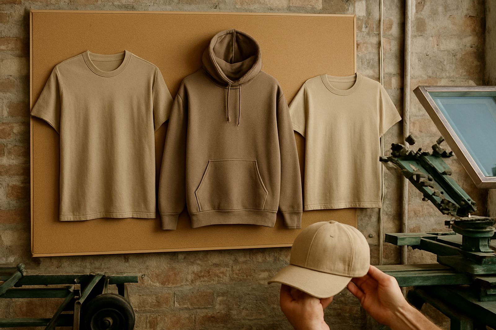
Not every print needs to sit on the front or back. Sleeve printing works well when you want a garment to feel complete without adding too much bulk. It is useful for sponsors, event dates, website lines or small marks of identity. Cap prints need a different approach again because the space is smaller and curved, so placement has to follow the shape of the panel.
Neck label prints are a practical option when clients want a cleaner finish inside the garment. They can replace a separate tag feel and keep the inside softer against the skin. This is handy for community groups, kids wear and repeat team orders where comfort matters. On humid days in coastal areas, even small details like this can make the garment easier to wear. It is a small touch but it makes a proper differnce.
- Sleeves suit small messages and sponsor marks.
- Caps need tight placement and simple artwork.
- Neck label prints help create a cleaner inside finish.
How we match placement to the garment and the job
At Brand-On Screen Printing, placement is not guessed. We look at the garment type, the size range, the artwork and the way the clothing will be used. A hoodie needs different spacing from a T-shirt. A cap panel needs a different layout from a polo shirt. We also check whether the print must work for a one-off event or for a repeat order that will be run again later in the year.
For local schools, clubs and businesses across Humansdorp, St Francis Bay, Cape St Francis, Oyster Bay, Kareedouw and Gqeberha, the most practical result usually comes from keeping the design simple and the position consistent. That makes reordering easier and keeps the whole set looking the same. It also helps with bulk packing, folding and bagging, which matters when garments must be handed out quickly and neatly.
- Artwork setup is checked before printing starts.
- Colour matching helps keep the same look across repeat batches.
- Sample strike-offs are useful when the placement needs approval first.