
Start With the Garment Itself
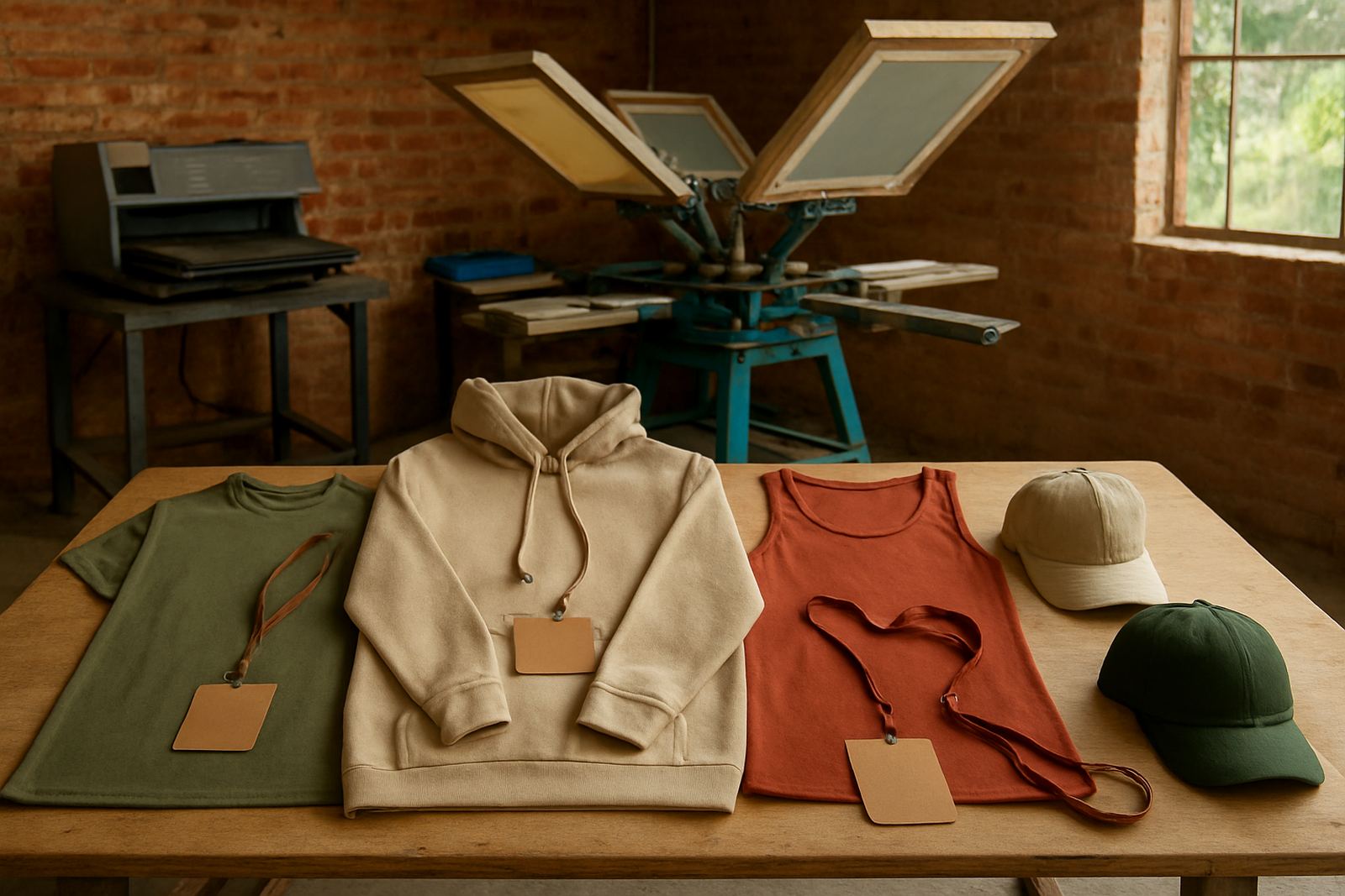
Before you choose ink, look closely at the garment colour, fabric type and where it will be worn. A white print on a navy hoodie can work well, but the same white on a pale stone shirt may look too faint outdoors. In Jeffreys Bay and the coastal towns nearby, sunlight is strong and salt air can mark lighter garments quicker, so the base colour matters more than many people think.
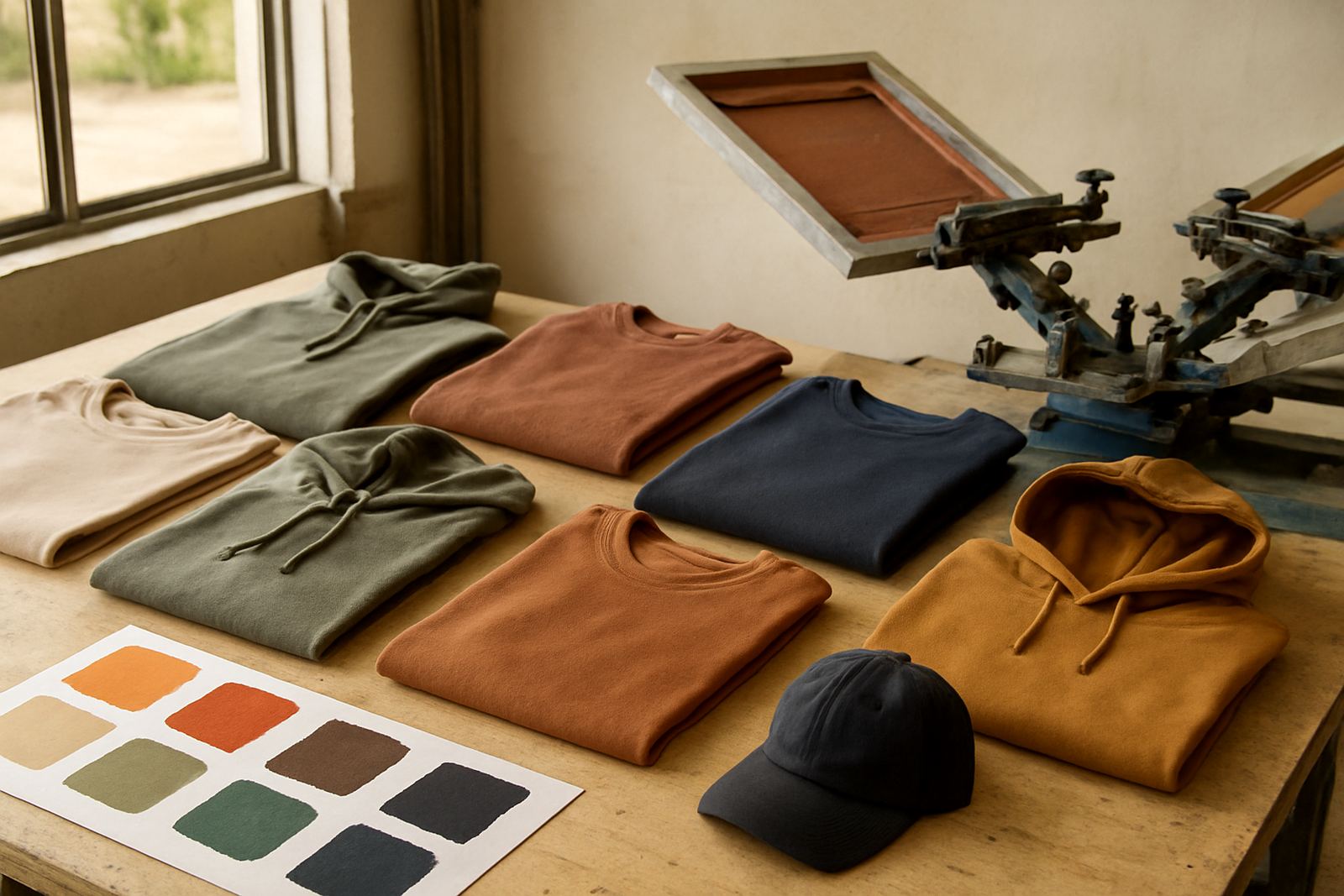
For everyday wear, mid tone garments usually hide dust, sweat and general handling better than very light colours. For school, club and event use, darker shades often hold up better during repeated washing. If the item will be worn near the sea, choose colours that will not show fading too quickly and ask for a sample strike-off if you are unsure.
Choose Ink Colours for Clear Reading
Ink should do more than match a brand colour. It needs to be readable from a distance, on curved surfaces and after several washes. Very fine text in a light ink on a light shirt can disappear in the sun, while a dark ink on a dark garment may lose contrast completely. If the artwork includes small lettering, pick stronger contrast first and worry about exact colour matching second.
For names, numbers and event details, simple combinations usually give the cleanest result. Black on white, white on navy, gold on black and red on grey are common choices because they stay easy to read. If your logo uses several shades, we can guide you on which part should carry the print and where a simplified version will work better.
Match the Print to the Garment Use
Different uses call for different colour choices. School shirts, staff wear, surf club clothing and event tees all face different conditions. A bright promotional shirt may need bold colours for attention, while a work shirt may need a darker base and a print that hides marks. For team kit, colour consistency matters because mixed batches can look untidy when the garments are worn together.
If you are ordering for a one off event, consider how the shirts will look in photos as well as in person. Strong colour contrast usually photographs better, especially in shade or late afternoon light. For repeat orders, keep a record of the garment colour, ink colour and print position so the next run matches the first one closely, even if the order comes months later.
How Colour Choice Changes by Printing Method
Not every print method behaves the same way. Some inks sit bold and solid on the garment, while others need a careful fabric choice to hold detail. On dark garments, certain colours may need an underbase to show properly. On stretch items and performance wear, the garment colour can influence how crisp the final print looks once the fabric moves and is washed.
Oversize back prints, sleeve prints and neck label prints need even more thought because the viewing distance and print area are different. A large back print can carry more detail, but sleeve printing works best with simpler colour blocks. Neck labels should stay neat and readable, so busy multicolour artwork is usually not the best fit there.
Practical Colour Checks Before You Order
A good colour choice starts with a few simple checks. Hold the garment up in daylight, compare it against your logo, and ask how it will look after a month of use. If your group includes children or outdoor staff, darker base colours may hide marks better and keep the clothing looking tidy for longer. If you are unsure, request a sample strike-off before committing to the full run.
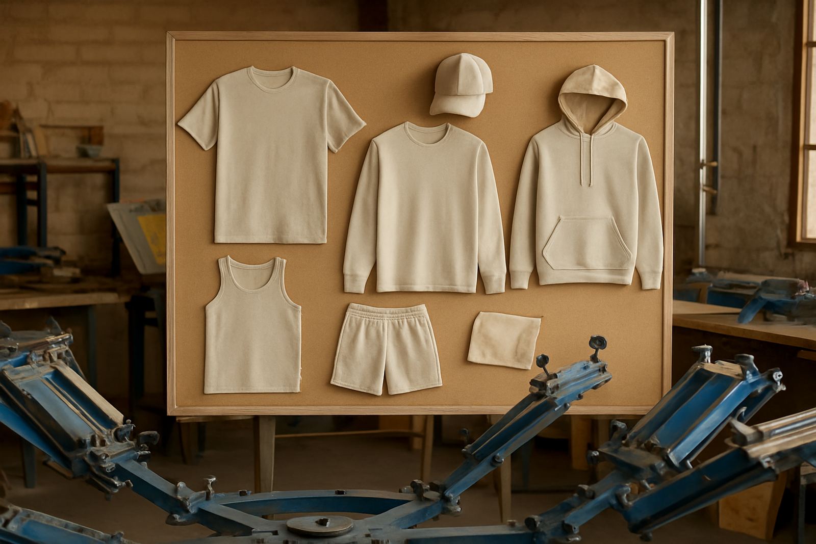
We also recommend checking the artwork on the actual garment size, not just on a screen. A colour that looks fine on a large tee may feel too heavy on a cap or too pale on a hoodie. Taking time here can save money later because fewer corrections are needed and the finished order is closer to what you wanted from the start.
A Simple Pre Order Checklist
Before you send in your order, use a short checklist to avoid colour mistakes. It helps if one person signs off the garment colour, one checks the ink choice, and one confirms the artwork. That small step prevents confusion when you are ordering for a school, a club, a business or a family event. It also helps when sizes and colours are split across a few different batches.
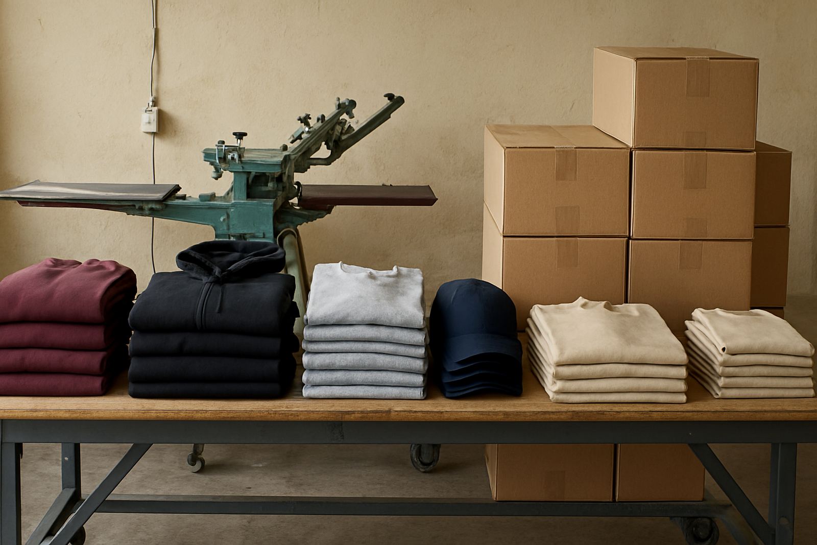
Our team in the Jeffreys Bay industrial area handles colour setup, matching and repeat order support for customers across Kouga and the wider region. If you need folding and bagging or bulk packing after print, we can keep the colours organised by size or by group. That matters when the final order goes out to Humansdorp, St Francis Bay, Cape St Francis, Oyster Bay, Kareedouw or Gqeberha.
- Garment colour confirmed
- Ink colour approved
- Artwork size checked
- Print positions agreed
- Sample strike-off requested if needed
- Packaging and quantity split confirmed